Mark Cavendish:
Never Enough
Title Sequence
CLIENT:
netflix
Agency:
pitch international
ROLE:
directing
+Art direction
+modelling
+rigging
+animation
My creative partner Jason & I had the opportunity to create a title sequence for a documentary commissioned by Netflix. As we worked with the director, he gave us a pretty open brief in which to pitch some ideas and we didn’t hold back.
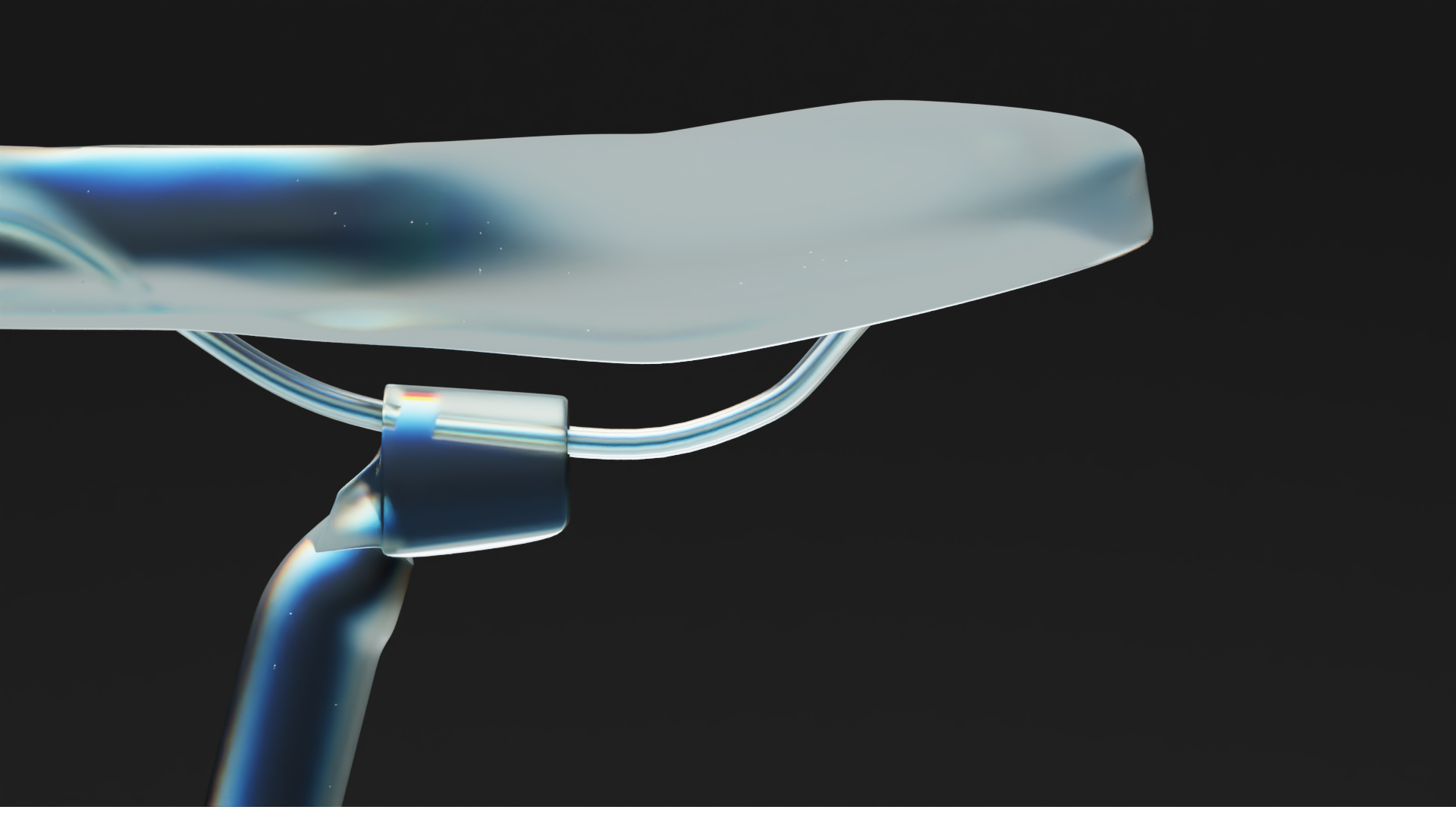
We envisaged an abstract glass bike, which would give us an x-ray look through the inner mechanics of the bike, which would reflect the inspection of the documentary into Mark Cavendish’s career. The shots would follow the journey of power transfer around the chain assembly from the intial pedal stroke, through the derailleurs and gear system and eventually revealing the full rear wheel and frame of the bike.
Check out the full title sequence on netflix
I’ve written up a full case study of the project below, detailing the amount of effort and passion we poured into these 45 seconds of animation.
CASE STUDY
Initial Concepts
One of our first thoughts when given the brief of creating a title sequence for a documentary about cyclist Mark Cavendish, was to use a series of detail shots of a bike to symbolise the dissection and analysis of career that the documentary was aiming to achieve.
Our main concern however was how to feature a bike in our shots, whilst efficiently use our time and resources. Our solution was to source a high quality model of a racing bike, and create an abstract material to apply to it to create a bike that would be more of a piece of art than functional bike. Combine with some cinematic lighting and camera moves, we could create multiple detail shots that could be fine tuned and animated all using the same rig.
Materials
During our exploration into materials we settled on two ideas to present to the client, a reflective transparent glass, or a translucent white polymer (highly inspired by our love for the Westworld titles. Another advantage of our choice of using a 3D pipeline, is that we could play with different lighting styles, and both of these materials were great examples of how drastically different they look under different lighting.
Some examples of some big lighting changes to choose our style, and below, some fine tuning adding some highlights and rim lighting to accentuate individual parts.
Remodelling
When it came to animating our bike model, and composing some of the details shots of the chain and the chain interacting with the gears, we noticed that the original model wasn’t modelled to the level of detail that we required, which combined with our glass material, exposed the fact that the chain and gears would not mesh together and would not be able to turn together and stay connected in a convincing way.
At this point we considered looking for more accurate models, but could not find any that were modelled to scale down to the chain links and gears. So I took plunge and decided to remodel the chain and learn a little about Geometry Nodes in Blender and gear ratios.
Chain Remodelling
When it came to animating our bike model, and composing some of the details shots of the chain and the chain interacting with the gears, we noticed that the original model wasn’t modelled to the level of detail that we required, which combined with our glass material, exposed the fact that the chain and gears would not mesh together and would not be able to turn together and stay connected in a convincing way.
At this point we considered looking for more accurate models, but could not find any that were modelled to scale down to the chain links and gears. So I took plunge and decided to remodel the chain and learn a little about Geometry Nodes in Blender and gear ratios.
Original topology of in individual chain link.
The higher resolution link that I modelled.
Gears, gears, gears, and more gears
Here are some examples of the tolerances that the original model was created with. Ultimately we owe a huge amount of thanks to Tim Shurink for the hard surface modelling of the rest of the bike, which was clearly meant for a more general view and probably never intended for the bike to be animated to look like it actually functioned.
The main problem I identified was that all of the gear teeth sizes were different. For the chain to believably flow throughout the whole gear system in one rig, this would have to be corrected to a uniform size.
The right tool for the job
Using geometry nodes, big shoutout to a tutorial by CGmatter which proved indispensible, I created a tool to create custom gears with completely adjustable variables for attributes such as gear size, number and size of teeth, and size, shape and number of cutouts. The image above is the node setup I ended up with (in a much more presentable state than it was when I was learning how to use it!).
Here is a quick demo of the tool in action, and a few images showing the resulting geometry and the improvement in tolerance with the new chain geometry.
Put it all together
and what have you got?
One of the most satisfying parts of this project, (aside from the final render, and seeing the finished edit on Netflix of course) was rigging all of my hard work together in one system with some nifty bits of maths to work out the gear ratios which would make the smaller gears turn at the correct rate when linked to front gear, and some controllers on the pedals to make them always align to the floor. All in all, this allowed us the freedom and control to animate the whole system as shown above with only 2 keyframes for the start and end position of one control gear.


